

6 Easy Steps to Better Icon Design
The Reworking Of An Icon
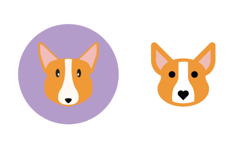
In the example images that follow in this article, the six steps discussed will be applied to a reworking of an icon of a dog (a Corgi, to be exact) that was recently submitted by an Iconfinder user named Kem Bardly. The icon had potential but was not quite polished enough to be considered “premium quality.” We provided Kem with some easy tips to follow, and, with a little reworking, his icons were ready for approval as a premium icon set. The image below shows the before and after versions of Kem’s icon. In the sections that follow, we will explain how to methodically go from before to after.
Note that while the guidelines discussed in the article are geared to web icons, they are generally applicable to print icons as well. The typical 300 dots per inch (DPI) of printed material makes pixel-perfection essentially meaningless. If you are a print designer reading this, all of the principles covered are applicable, but you can largely ignore the pixel-perfection pieces.
Three Attributes Of Effective Icon Design
Icons that are well designed exhibit a methodical and deliberate approach to the three major attributes that make up any icon design: form, aesthetic unity and recognition. When designing a new icon set, consider each of these attributes in an iterative approach, starting with the general (form) and proceeding to the specific (recognizability). Even if you’re creating a single icon, these three attributes are still implied and can be extrapolated from a single design.
No doubt, more than three attributes make up effective icon design, but the three elaborated below are a good place to start. For the sake of relative brevity, we have focused on what we consider to be the three main attributes.
FORM
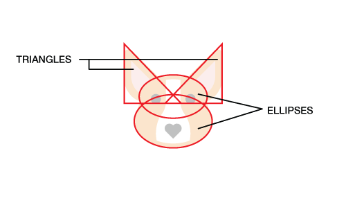
Form is the underlying structure of an icon, or how it is made. If you ignore the details of an icon and draw a line around the major shapes, do they form a square, a circle, a horizontal or vertical rectangle, a triangle or a more organic shape? The primary geometric shapes — circle, square and triangle — create a visually stable foundation for icon design. In our Corgi example by Kem Bardly, the dog’s head is made up of two triangles and two ellipses. Just as one would start a drawing by sketching the largest, simplest shapes and then refining towards greater and greater detail, one would start an icon from the simplest shapes and then add more detail — but only as much detail as is needed to communicate the concept being represented, be it an object, idea or action.
AESTHETIC UNITY
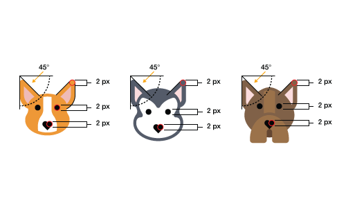
The elements that are shared within a single icon and across an icon set are what we call the aesthetic unity. These elements are things like rounded or square corners, the specific size of corners (2 pixels, 4 pixels, etc.), limited and consistent line weights (2 pixels, 4 pixels, etc.), the style (flat, line, filled line or glyph), the color palette and more. The aesthetic unity of a set is the collection of design elements and/or choices you repeat throughout the set to visually tie it together as a cohesive whole. In the examples below, notice that each of the three dogs from Kem’s set share common elements, such as the 2-pixel rounded corners, the 2-pixel-thick stroke around the dogs’ faces and the heart-shaped noses.
RECOGNIZABILITY
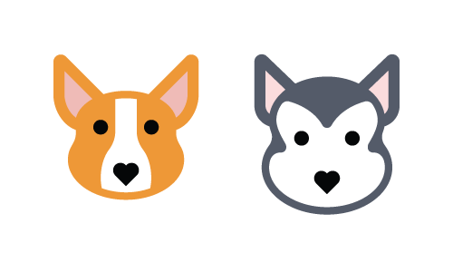
Recognizability is a product of an icon’s essence or what makes an icon unique. Whether an icon works ultimately depends on how easily the viewer comprehends the object, idea or action it depicts. Recognizability includes showing the properties that the viewer commonly associates with that idea, but it can also include elements that are unique or unexpected, such as the heart for the Corgi’s nose. Remember that recognizability refers not only to comprehension of the object, idea or action being depicted, but also to recognition of your unique icon set. In this respect, aesthetic unity and recognition can, and often do, overlap. In the image below, we recognize each of the two dogs as a Corgi and Siberian Husky, respectively, because of their unique colors, head shape and ears, while still recognizing them as part of the same set because of the shared design and style elements.
Thus far, we have looked at what we consider to be the three main attributes of effective icon design. In the next section, we will look in depth at six steps to properly address these three areas of concern.
The Six Steps
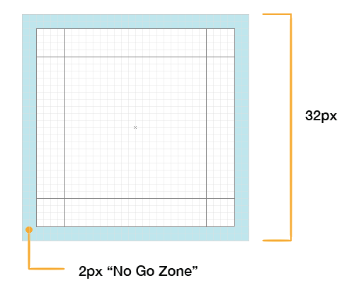
ALWAYS START WITH A GRID
The benefits of various grid sizes would best be handled in a separate article. For our purposes, we’ll work with a 32 × 32-pixel grid. Our grid also contains some basic guides to help us create the underlying form of each icon design.
The outer 2 pixels of the grid are what we call the “no-go zone.” Avoid putting any part of the icon in this space unless absolutely necessary. The purpose of the no-go zone is to create some breathing room around the icon.
Part of the form of an icon is the general shape and orientation. If you draw a line around the outside edges of an icon — the bounding box, if you will — the shape will generally be a square, circle, triangle, horizontal rectangle, vertical rectangle or diagonal rectangle.
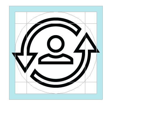
Circular icons are centered in the grid and will usually touch all four of the outermost edges of the content area, without going into the no-go zone. Note that a common reason for breaking the no-go zone rule is if some accent or minor element needs to extend beyond the circle in order to maintain the integrity of the design, as demonstrated below.
Square icons are also centered in the grid but do not, in most cases, extend all the way to the outermost edges of the content area. To maintain a consistent visual weight with circular and triangular icons, most rectangular and square icons will align to the key line in the middle (the orange area in the image below). When to align to each key line is determined by the visual weight of the icon itself; getting a feel for when to use which size just takes practice. Look at the square layout image below. The three concentric squares mentioned above are shown in light blue, orange and light green.
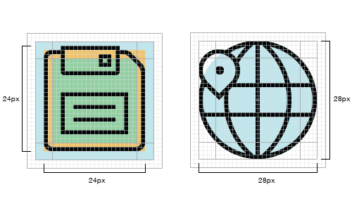
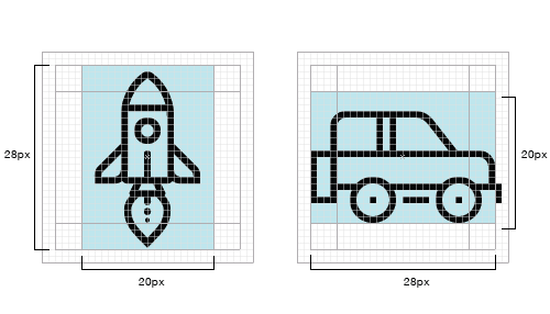
Inside the 32-pixel square, you will notice the 20 × 28-pixel vertical and horizontal rectangles. We loosely follow these rectangles for icons that are horizontal or vertical in orientation and try to make the dimensions of any icons oriented thus, to match the 20 × 28-pixel dimensions of these rectangles.
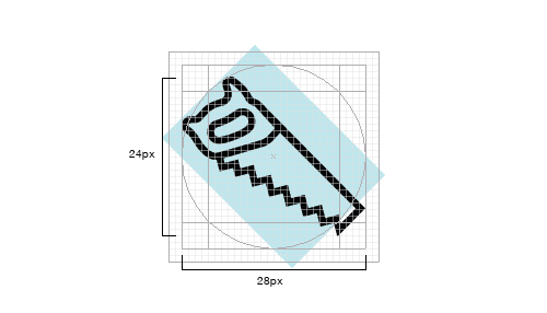
Diagonally oriented icons are aligned to the edges of the circular content area, as seen in the image below. Notice that the outermost points of the saw are approximately aligned to the edges of the circle. This is an area where you do not need to be exact; close is good enough.
Remember that you do not need to follow the grid and guides exactly every time. The grid is there to help you make the icons consistent, but if you have to choose between making an icon great and following the rules, break the rules — just do so sparingly. As Hemmo de Jonge, better known by his nickname Dutch Icon, has said:
The essence of an individual icon outweighs the importance of set cohesion.
I really like reading an article that can make people think.
Also, many thanks for permitting me to comment!