

CC7182NI Programming for Data Analytics – Individual Coursework
Table of Contents
Part 1 – Analysis of a Marketing Campaign Dataset
2) Data Transformation and evaluation
a) Categorical to binary value conversion
b) Categorical values are converted to ordinal values
c) New age_category column is created.
E. The total number of clients whose job title is housemaid
F. The success rate of the previous marketing campaign
G. The average age of the clients who are entrepreneurs
a) Calculate and show summary statistics
b) Calculate and show correlation & display heatmap
C. Count plot of job type with relation to term deposit
D. Bar graph of average balance of each age category
Part 2 – Analysis of Livestock Data of Nepal
Table of Figures
Figure 1: Four main types of Data Analytics (Stevens, 2022)
Figure 2: Characteristics of dataset
Figure 3: Characteristics of data
Figure 4: Changing education values into ordinal values
Figure 5: Change marital values into ordinal values
Figure 6: Changing months into ordinal values
Figure 7: Changing poutcome values into ordinal values
Figure 8: Creating age_category
Figure 9: Transforming seconds to minutes
Figure 10: Correlation between columns in df1 data frame
Figure 11: Heatmap of columns in df1 data frame
Figure 12: Histogram & Boxplot visualizing age distribution
Figure 15: Histogram & Boxplot of balance distribution
Figure 16: Box plot of Balance distribution
Figure 17: Histogram & Boxplot of Duration distribution
Figure 18: Box plot of Duration
Figure 19: Count plot of job type with relation to term deposit
Figure 20: Bar graph of average balance of each age_category
Figure 22: Bar plot for balance per job type
Figure 23: Bar plot diagram for housing loan per job type
Figure 24: Pie chart distribution by age category
Figure 25: Term deposit subscription by age category
Figure 26: Yak/Nak/Chauri population per region
Figure 27: Displaying 5 rows from every table
Figure 28: Horse/Asses population per region
Figure 29: Milk production per region
Figure 30: Meat production per region
Figure 31: Cotton production per district
Figure 32: Egg production per region
Figure 33: Rabbit population per region
Figure 34: Wool production per region
Figure 35: Yak/Nak/Chauri population per region
Table of Tables
Table 1: horse-asses population in Nepal by district
Table 2: Milk animals & milk production in Nepal by district
Table 3: Net meat production in Nepal by district
Table 4: Production of cotton in Nepal by district
Table 5: Production of egg in Nepal by district
Table 6: Rabbit population in Nepal by district
Table 7: Wool production in Nepal by district
Data analytics is a technique for studying datasets to discover diverse outcomes. By employing analytics tools or methods, we have the capability to identify distinct patterns and behaviors of the subject in question (business or sector) using raw data. With the use of this technique, we may also forecast how the subject will do in the future. Data analytics is therefore crucial for developing specialized systems that include automation, machine learning, and other technologies.
Analysts are able to grasp their clients, examine their promotional activities, create well-planned policies, and ultimately enhance their business outcome in order to boost business outcomes. (Lotame,2022)

Figure 1: types of Data Analytics (Stevens, 2022)
There are two distinct sections in the contents of this course. Using several libraries including Matplotlib, Pandas, NumPy, and Seaborn, we will perform several data analytics and visualization tasks on a marketing campaign dataset based on a case study of a Portuguese bank in the first section.
The second section contains eight datasets related to Nepali livestock, which we will combine, clean up, and analyze using exploratory data analysis (EDA).
Part 1 – Analysis of a Marketing Campaign Dataset
1) Data Understanding
Bank.csv is the dataset which has been made available. The dataset comprises of information from a bank in Portugal’s marketing campaign. Calls were made to customers as part of the marketing campaign to collect data. It has been seen that the same consumer has been called repeatedly with the intent to inform them of the product subscription.
Findings
There are 45211 customer entries in the dataset. Each record has 17 variables, each of which contains different customer-related data. Important information about the consumer is learned by looking at the attribute in the dataset. Analysts must correctly access the information in order for decision makers to make informed decisions.
within a financial institution, such a bank. A bank has to comprehend the spending, saving, investing, and other behaviors of its customers in order to anticipate potential results and reduce risks. Additionally, after thoroughly comprehending its clients’ financial objectives, it delivers items to them in a timely manner.
Most reputable banks will utilize packages that target customers and businesses looking for precise financial safety and insurance. These banks will also deal with the potential danger of operating businesses that require significant investment and risk.
In addition, many customers may also consider other interests in order to create a bank account. The bank workers are aware from prior experience that different categories of consumers demand a tailored response due to the diversity of their issues.
We will learn about different such topics and problems that financial companies deal with on a daily basis as we explore this project.
Column Characteristics in the dataset
| S. N | Attributes | Characteristics | Data type |
| 1 | age | age of customer | int64 |
| 2 | job | Job type of customer | object |
| 3 | marital | marital status of customer | object |
| 4 | education | Education level of customer | object |
| 5 | default | credit goes to default? | object |
| 6 | balance | (In euros) average yearly balance of customer | int64 |
| 7 | housing | Does customer have housing loan? | object |
| 8 | loan | Does customer have personal loan? | object |
| 9 | contact | contact communication type of a customer | object |
| 10 | day | last day in the month | int64 |
| 11 | month | last contact month of year | object |
| 12 | duration | (in seconds) last contact duration | int64 |
| 13 | campaign | number of times the customer is communicated in this campaign (contains last contact) | int64 |
| 14 | pdays | After the client was last communicated from a previous campaign, number of days that passed by (-1 denotes that the customer was not earlier communicated) | int64 |
| 15 | previous | number of times customer is communicated before the campaign | int64 |
| 16 | poutcome | The results or outcome of the earlier promotion campaign | object |
| 17 | y | The customer is subscribed to a term deposit or not? | object |
table 2: Characteristics of dataset

Figure 3: Characteristics of dataset
2) Data Transformation and evaluation
a) Categorical to binary value conversion
We must import several data processing and data visualization modules, including pandas, NumPy, seaborn, matplotlib, and others, in order to carry out this assignment. After that, we must read “bank.csv” and store it to a data variable using the pd.read_csv method.
Housing, loan, default, and goal variable ‘y’ all have categorical values in the figure below. We’ll convert these category data to binary values.

The get_dummies() function is used to convert binary values from category variables. The names of the columns (default, housing, loan, and y) are then sent so that their values may be changed.
The output of using the get_dummies() method is two columns with the identifiers “no” and “yes.” For instance, there are now two new columns, default_yes and default_no.
All yes values in the default_yes column will be changed to 1. Additionally, any no entries in the default_yes column will be changed to 0. This holds true for other columns as well, including (housing, loan, and y).

We will remove the columns marked (default_no, housing_no, loan_no, and y) from the figure below. Applying the k-1 encoding method, which drops the first function and leaves its value set to true, is necessary to accomplish this. Additionally, just the column_yes column ought to be kept.
All yes values are assigned to 1 in the default_yes column, which is the default column. Additionally, the default_yes column in the default column has all no values changed to 0.

We will change the column name for “default_yes” in the diagram below to “default”. The remaining columns, including (loan_yes), (housing_yes), and (y_yes), will all be renamed as loan, housing, and y, respectively.
Therefore, categorical data are converted to binary values in this manner using specific columns where no is 0 and yes is 1.

a) Categorical values are converted to ordinal values
Order is a crucial component of ordinal encoding. We will thus strictly adhere to order in the next actions.
Job conversion to ordinal values
Now that a dictionary called “job_dict” has been formed, the job column, which consists of an index number, should be given unique values.

In the figure below, a column called “Job_Ordinal” is established to show and save ordinal values using a dictionary called “job_dict.” Additionally, two columns are shown based on the values of the columns next to them.

Changing education to ordinal values
A. Making a duplicate of the original data frame.
B. Discovering special values in the “education” column.
C. We must establish a label called “education label” in order to categorize the order.
D. Using a class ordinal encoder to pass the label in the categories function.
E. We must utilize the transform and fit approach in order to pass the “education” column.
F. The ‘drop_duplicates()’ function provides the unique values.

Figure 4: changing education to ordinal values
Changing marital values into ordinal values
A. Making a duplicate of the original data frame.
B. The unique values are chosen in the “marital” column .
C. Make a “marital label” to organize the order into groups.
D. Use the ordinal encoder class to send the label using the categories method.
E. Apply the transform and fit technique to the marital column in order to pass it.
F. Method drop_duplicated() is utilized to provide unique values.

Figure 5: Transforming marital to ordinal values
Converting contact values to ordinal values
Now, a dictionary called “contact_dict” is made, and the contact column’s unique values are assigned with an index number.

Additionally, a new column called “Contact_Ordinal” is established to show and save the ordinal values using a dictionary called “contact_dict.” And two columns with their corresponding values are displayed.

Months are converted to ordinal values
Each month will be allocated to an ordinal with the aid of ordinal encoding.
A. Making a duplicate of the original data frame.
B. Identify the distinct numbers in the specific column labeled “month.”
C. Create a label called “months” to categorize the order.
D. Forward the label using the ordinal encoder class and the categories method.
E. Use the transform and fit technique to pass the month column.
F. Use the ‘drop_duplicates()’ function when providing unique values.
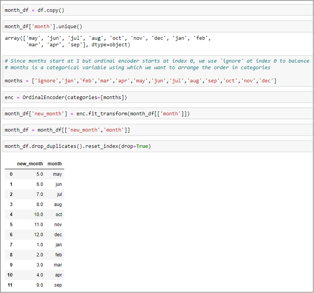
Figure 6: months to ordinal values conversion
poutcome to ordinal values transformation
A. Making a duplicate of the original data frame.
B. Identify the distinct values in the specific column “poutput”.
C. Create a label called “poutcome_label” to categorize the order.
D. Use the ordinal encoder class to send the label in the categories method.
E. Use the transform and fit technique to pass the poutcome column.
F. Use the ‘drop_duplicates()’ function to identify the unique values.

Figure 7: poutcome into ordinal values conversion
b) New age_category column is created.
It is clear that our data structure includes every column in the list. Now data will be assigned to the newly formed column age_category.

Bins will be used to organize things into categories. And labels will be used in addition to identify such groupings. Bins shall be aligned with their corresponding labels.
As seen in the graphic below, a person who is 58 years old is positioned with the ‘age_category’ label for those 50 to 59 years old.

Figure 8: Creation of age_category
D. Median of the Clients

The clientele’ median age is 39.
E. The total number of clients whose job title is housemaid
According to the aforementioned data, there are currently 1240 clients with the title “housemaid.”

F. The success rate of the previous marketing campaign

The abvoe findings show that the preceding marketing campaign’s success rate was 0.033421.
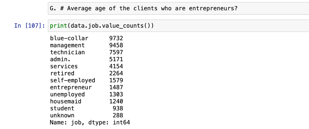
G. The average age of the clients who are entrepreneurs
I. The minutes to Seconds Conversion
We observe that the duration column contains the time values in seconds.
Minutes must be applied to this.
We must first divide the length of the column by 60. Lastly, it creates and stores a new column called “duration_minutes.”

Figure 9: Seconds to minutes conversion
1) Initial Data Analysis
a) Calculate and show summary statistics
Only certain columns (age, balance, duration, campaign, and duration_minutes) will be calculated in this section. We will thus choose these specific columns and save them in the df1 data frame using the iloc function.

Sum
In this part, the sum function and a df1 data structure will be used to determine the sum. We changed the data type of the duration_minutes column from float to int. As a consequence, the total results for all of the columns in the df1 data frame are calculated.

Mean
In this part, the mean function is used to determine the mean using a df1 data frame. The df1 data frame’s mean outcome for every column is thus determined.

Median
The median function is used to determine the median in this section. As a consequence, the median value for each column on the df1 data frame is determined.

Standard Deviation
The std() function is used to compute the standard deviation in this section. As a consequence, the standard deviation for each column in the df1 data frame is determined.

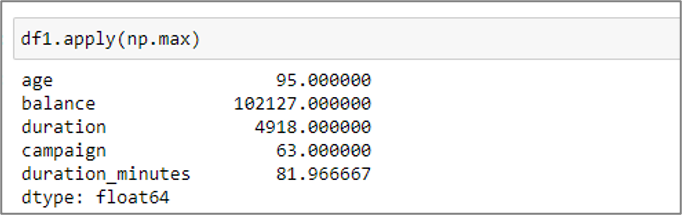
Maximum
The (np.max) function is used to determine maxima in this section. The df1 data frame’s highest value result is then determined for each column.
Minimum
The np.min function is used in this section to compute minutes. As a consequence, the minimum outcomes for every column in the df1 data frame are determined.

b) Calculate and show correlation & display heatmap
We utilize pandas dataframe.corr() method to show the pairwise correlation of related columns in the data set. Age, Balance, Duration, Campaign, and Duration_Minutes are the four columns of the data frame df1 that are correlated in the image below. However, it is also clear that non-numeric values in the data frame’s column are always disregarded.

Figure 10: Correlation between columns in df1 data frame


Figure 11: Columns in df1 data frame showing Heatmap
The correlation values, ranging from -1 to 1, are shown. The darker hue of the heatmap in the illustration indicates factors that are positively connected. And the lighter colour of the heat map represents the variable that is adversely connected.
As the value gets closer to 0, we can see that there is not a linear connection between the two variables. When the correlation is near to 1, the variables become positively connected. As a result, if one grows, the other will as well. Additionally, when the correlation value is -1, they are comparable to one another. It is clear that negative correlation works in the other direction. For instance, when one variable’s value falls, the other variable rises.
Readings of Heatmap:
• A linear, positive correlation between balance and age can be shown. Age and balance have a 0.098 connection, which is very close to 1. If one increases, the others will follow suit. The balance and earnings of the consumer will likewise be larger if his age is higher.
• A negative correlation between Duration and Campaign might be shown. Duration and Campaign have a correlation of -0.085, which is very close to -1. If one rises, the other will fall. Customers will participate for shorter periods of time with each session if they are communicated with more often.
• There is no significant association amongst Balance and Duration since their correlation coefficient is 0.22. Thus, they aren’t closely related to one another.Data Exploration and Visualization
b) Histogram & Box plots
- Histogram & Box plots for the variable Age

Figure 12: Age distribution visualization using a histogram and boxplot

The diagram shown above shows that there were six classes, with ages ranging from 18 to 95. Ages 30 to 40 have the highest-class value and appear most frequently. It has a median value of around 18,000. Long tail has a positively skewed histogram since it is on the positive side of the peak. We may infer that the histogram is skewed to the right since the long tail is located on the right side of the peak. It has a mean age of 39. As can be seen, the class 30-40 contains the greatest number of values, followed by 40-50, 50-60, 20-30, 60-70, and 70-95.

Figure 13: Box plot quartiles

Figure 14: Box plot of age
the Q3 to Q1 interquartile range (As can be seen, 50% of values fall inside the interquartile range.)
(Q1) Lower Quartile
Using df1.age.describe(), the value of Q1 is estimated to be 33. This indicates that 24% of the clients in our sample are under the age of 33.
Average (Q2)
39 is the measured median value. Between Q1 and Q2, there are around 25% fewer clients. This indicates that 25% of the clients in our sample are between the ages of 33 and 39.
(Q3) Upper Quartile
Q3 has a computed value of 48. Between Q2 and Q3, there are around 25% fewer clients. This indicates that 25% of the clients in our dataset are between the ages of 39 and 48.
- Histogram & Box plots for the variable Balance

Figure 15: Histogram & Boxplot of balance distribution

Six classes are included in the histogram, as can be seen in the image above. Only the numbers between 0 and 25 have significant values. The values that follow index 25 are unimportant. From 25 indexes, six classes using function bins have been built.
The histogram shown above demonstrates that it is favorably skewed since the long tail is on the positive side of the peak. Histogram is skewed to the right because long tail is on right side of peak.
The balance column also has significant negative balance numbers. It can be inferred that consumers with negative balances may have obtained a credit card. As a result, the irregularity in the balance values has been taken into account when determining the median and quartiles.

Figure 16: Box plot of Balance distribution
- Histogram & Box plots for the variable Duration

Figure 17: Histogram & Boxplot of Duration distribution

The function bins have been used to construct six classes. The six classes are numbered 0 through 3025. The range between class 0 to 500 is where the highest values are consistently found. It has a 4400 mode value. It may be inferred that the histogram is positively skewed since its long tail is on the side of the positive peak. Its average duration is 242. We observe that the majority of values fall into the classes 0-500, as well as 500-1000, 1000-1500, 1500-2000, 2000-2500, and 2500-3025, respectively.

Figure 18: Box plot of variable Duration
Interquartile range = Q3-Q1 (it is clear that 50% of values fall inside this range).
(Q1) Lower Quartile
Q1’s value is 96 when using df1.duration.describe() to compute it. This indicates that 25% of the clients in our sample spoke for less than 96 seconds at the start of the campaign.
Average (Q2)
166 is the computed median value. Between Q1 and Q2, there are around 25% fewer clients. This indicates that 25% of the clients in our dataset spoke for between 96 and 166 seconds at the time of the campaign.
(Q3) Upper Quartile
Q3 has a computed value of 299 in it. Between Q2 and Q3, there are around 25% fewer clients. This indicates that 25% of consumers in our sample spoke for between 199 and 299 seconds at the time.
C. Count plot of job type with relation to term deposit


Figure 19: Count plot of job type vs term deposit
From the above figure, it can be seen that the majority of customers fall under the management job group, with the next highest percentages belonging to the blue-collar, technical, services, retired, jobless, student, entrepreneur, self-employed, housemaid, and unknown work categories.
As a result, the bank may target customers who are in management, blue-collar, technical, or administrative jobs. We can also see that the bank has had trouble attracting customers in the categories of business owners, housemaids, and those without jobs.
D. Bar graph of average balance of each age category
We must utilize the functions mean() and groupby() to calculate the balance average for each age group.


Figure 20: Bar graph of average balance of each age_category
The average balance is gradually growing in each class age category, according to the analysis of the bar graph shown above. This led to the conclusion that age_category and average_balance had positive relationships with one another. The age group will rise along with the balance.
Additionally, the value from class 50-59 expanded to the final class age group 80-100, as can be seen. This indicates that customers with superior average balances are often 50 years of age or older. As a result, the four classes included in the last have a greater average balance than the younger classes.
1) Further Analysis
- Diagram of Pair plot


Figure 21: Diagram of Pair plot
The results of the pair plot diagram are the same as those of the previously exhibited and discussed head map diagram.

The correlation values in the diagram above have been set to between -1 and 1. As can be seen, the variables that are negatively connected are lighter in shade than those that are favorably correlated. The association between the dark shade and the diagonal line with value 1 is also positive. Additionally, boxes with negative values and lighter shades have a negative connection.
In the image, when the value is closer to 0, there is not a linear association between the two variables. When the correlation is closer to 1, the variables are positively associated with one another. Therefore, if one rises, the other will as well. When the correlation values are near -1, they frequently exhibit similarities with one another. Last but not least, negative correlations frequently behave in an inverted manner. When one goes up, the others tend to go down.
- Bar plot diagram of balance per job type

Figure 22: Bar plot of balance per job type
Every employment type’s bank balance is displayed in the following diagram. A financial organization could wish to be aware of a customer’s employment details and bank account balance. Information of this kind is crucial to a financial institution’s ability to develop plans.
According to the above figure, the category labeled “retried” has the largest balance, followed by “management,” “self-employed,” “unknown,” and so on. Blue-color and services have the lowest balance of any category. Customer age and variable balance are connected. An elderly, blue-colored client will have more balance than a younger, red-colored consumer working in the management area. Therefore, they often have a negative association. If one rises, the other must fall.
- Bar plot diagram of housing loan per job type

Figure 23: Bar plot diagram of housing loan per job type
Every employment type’s home loan is displayed in the following diagram. A financial organization could wish to be aware of a customer’s employment details and bank account balance. Information of this kind is crucial to a financial institution’s ability to develop plans. The financial institution could be curious in the clientele who apply for mortgage loans based on their line of work.
According to the graphic above, the blue-collar group includes the majority of borrowers of home loans, then entrepreneurs, administrators, managers, technicians, the employed and jobless, students, housemaids, and so on. Additionally, a variable housing loan is tied to the customer’s age. For instance, a middle-aged consumer has a greater chance of obtaining a mortgage than a significantly older or younger one.
- Pie chart distribution as per Age Category

Figure 24: Pie chart distribution by age category
The proportion of customers are distributed according to age category, as shown in the above diagram. We can also see that the age_category 70-79 has the most customers, followed by 80-100, 60-69, 18-19, 20-25, 26-30, and so on.
Financial institutions might start and target the age range 70–79 in order to concentrate on their objectives and demands. Because it has the fewest customers, the category (42-49) must also be taken into account.
- Term deposit subscription by age category

Figure 25: Term deposit subscription by age category
The illustration above demonstrates that the older age groups (70-79, 80-100, and 60-69) have the most subscriptions since they have the most customers. The middle-aged folks don’t seem to be interested in term deposits. The financial institution may thus need to employ a variety of tactics and plans for those age groups.
Part 2 – Analysis of Livestock Data of Nepal
1) Data Understanding
Eight data sets containing information on the production of livestock and other goods in Nepal’s various regions and districts have been provided as part of this project. We will combine, clean up, and conduct an exploratory data analysis on those data in the part that follows.

horseasses-population-in-nepal-by-district.csv

| Column | Data type | Nullable | Description |
| district | object | non-null | different districts & regions list |
| horses/asses | int64 | non-null | population of horses/asses |
Table 1: horse-asses population in Nepal by district
milk-animals-and-milk-production-in-nepal-by-district.csv

| Column | Data type | Nullable | Description |
| district | object | non-null | names of district and regions |
| milking cows no | int64 | non-null | number of cows that give milk |
| milking buffaloes no | int64 | non-null | number of buffaloes that give milk |
| cow milk | int64 | non-null | volume cows’ milk produced (liters) |
| buff milk | int64 | non-null | volume buffs’ milk produced (liters) |
| total milk produced | int64 | non-null | volume total milk produced (cow+buff) |
Table 2: Milk animals & milk production in Nepal by district
net-meat-production-in-nepal-by-district.csv

| Column | Data type | Nullable | Description |
| district | object | non-null | names districts and regions |
| buff | int64 | non-null | total buff meat produced |
| mutton | int64 | non-null | total mutton meat produced |
| chevon | int64 | non-null | total chevon meat produced |
| pork | int64 | non-null | total pork meat produced |
| chicken | int64 | non-null | total chicken meat produced |
| duck meat | int64 | non-null | total duck meat produced |
| total meat | int64 | non-null | total sum all meat categories |
Table 3: Net meat production in Nepal by district
production-of-cotton-in-nepal-by-district.csv

| Column | Data type | Nullable | Description |
| district | object | non-null | d names istricts and regions |
| area (ha.) | int64 | non-null | total area used in hectare Cotton produces |
| prod (mt.) | int64 | non-null | total cotton production in metric ton |
| yield (kg/ha.) | int64 | non-null | total sum cotton yield |
Table 4: Production of cotton in Nepal by district
production-of-egg-in-nepal-by-district.csv

| Column | Data type | Nullable | Description |
| district | object | non-null | names districts and regions |
| laying hen | float64 | non-null | number egg laying hen |
| laying duck | int64 | non-null | number egg laying duck |
| hen egg | int64 | non-null | total egg produced by hen |
| duck egg | int64 | non-null | total egg produced by duck |
| total egg | int64 | non-null | total sum of egg produced |
Table 5: Production of egg in Nepal by district
rabbit-population-in-nepal-by-district.csv

| Column | Data type | Nullable | Description |
| district | object | non-null | names districts and regions |
| rabbit | int64 | non-null | population of rabbit |
Table 6: Rabbit population in Nepal by district
wool-production-in-nepal-by-district.csv

| Column | Data type | Nullable | Description |
| district | object | non-null | names districts and regions |
| sheep no | int64 | non-null | Numbers sheep |
| sheep wool produced | int64 | non-null | total wool produced |
Table 7: Wool production in Nepal by district
yak-nak-chauri-population-in-nepal-by-district.csv
| Column | Data type | Nullable | Description |
| district | object | non-null | names districts and regions |
| yak/nak/chauri | int64 | non-null | population yak/nak/chauri |
table 26: Yak/Nak/Chauri population per region

Figure 27: Displaying 5 rows from every table
1) Data Merging and Cleaning
I discovered various errors and inconsistencies in the data after studying the data set. This can be the result of the challenges encountered when collecting site data.
horse data set Cleaning

milk data set Cleaning

meat data set Cleaning

rabbit data set Cleaning

yak data set Cleaning

all datasets Merging
The district column is a common one in the dataset. Through the use of a full outer join, the district column will be used to combine the entire dataset.

As a result, we integrated all datasets. The new data consists of 96 rows and 26 columns. The following information is provided on the kind of table data and the structure of new data. We have changed the nan values to 0 by using the method fillna(). It supports the precise and straightforward use of data analytics.
The amount of milk produced in total throughout Nepal is approximated using the total number of cows produced and their sum in each area.


2) Explanatory Data Analysis
Horse/Asses population by region

Figure 28: population per region of Horse/Asses
The total number of horses and asses in Nepal are depicted in the diagram above, broken down by area. The mid-western area is where there are the most horses and assessors, according to the diagram. Additionally, the central area has the lowest population of horses and asses.
We can infer that the mid-western region has a larger area than other regions. Overall, it comprises of remote parts of Nepal with no connectivity to highways. In order to go about, a lot of people utilize horses or assess.
Milk production by region

Figure 29: Milk production per region
We can observe the entire volume of milk produced across all of Nepal in the graphic above. The data analysis shows that the central region has the largest production, followed by the eastern, western, mid-western, and far-western regions.
Finally, it is clear that the far-western region is the smallest and most isolated from the other sections.
Meat production per region

Figure 30: Meat production per region
We can observe the total amount of meat produced in Nepal by region in the figure above. The data analysis shows that the central region has the largest production, followed by the eastern, western, mid-western, and far-western regions.
Because the far West is a smaller territory. As a result, they do not rely much on meat.
Cotton production per district

Figure 31: Cotton production per district
We can see the total amount of cotton produced in Nepal per district in the figure above. By examining the statistics, we can tell that the dang district, followed by the banke and bardiya regions, has the largest production.
Due to its excellent environment, the dang district is better appropriate for cotton growing.
Egg production per region

Figure 32: Egg production per region
We can observe the total quantity of eggs produced per region in Nepal in the figure above. The data analysis shows that the central region has the largest production, followed by the eastern, western, mid-western, and far-western regions.
Due to its larger population, the central area has a higher need for eggs.
Rabbit population per region

Figure 33: Rabbit population per region
We can observe the entire quantity of rabbit production per region in Nepal in the figure above. The data analysis shows that the midwestern region has the largest production, followed by the western, central, eastern, and far western regions.
Due to its demographic structure, the midwestern area is far better favorable for the production of rabbits.
Wool production per region

Figure 34: Wool production per region
We observe the total amount of wool produced in each area of Nepal in the figure above. The data analysis reveals that the midwestern area has the largest production, followed by the western, far western, eastern, and central regions.
Due to its population makeup, the Midwestern area is significantly better ideal for the manufacturing of wool.
Yak/Nak/Chauri population per region

Figure 35: Yak/Nak/Chauri population per region
The entire quantity of yak, nak, and chauri production by regions in Nepal is shown in the image above. The data analysis reveals that the eastern area has the largest production, followed by the mid-western, western central, and far-western regions.
Because of its inadequate transportation, the eastern area is far better ideal for yak, nak, and chauri production. People must therefore depend more on yak, nak, and chauri.
Similar to the MW. Region, the W. Region is home to some of the tallest mountains on earth. This explains the high yak population in these areas. The mountainous area is not very accessible to FW Region. As a result, there are not many yak, nak, or chauri living there.
References
Abhishek, S., 2020. analyticsvidhya. [Online] Available at: https://www.analyticsvidhya.com/blog/2020/02/joins-in-pandas-master-the- different-types-of-joins-in-python/
[Accessed 21 January 2022].
Avantika, M., 2022. simplilearn. [Online] Available at: https://www.simplilearn.com/data-science-vs-big-data-vs-data-analytics- article#what_is_data_analytics
[Accessed 14 Januray 2022].
geeksforgeeks, 2021. geeksforgeeks. [Online] Available at: https://www.geeksforgeeks.org/python-pandas-dataframe-isin/ [Accessed 21 January 2022].
JavaTpoint,
Available sum#:~:text=sum()%20function%20is%20used,the%20values%20in%20each%20column. [Accessed 22 January 2022].
2022. JavaTpoint. [Online] at: https://www.javatpoint.com/pandas-
Appendix
- What is Term Deposit?
Term deposits are fixed-term investments made when funds are put into a bank account. Term deposits typically have short maturities, ranging from a month to a few years.